Skip to Main Content

SPSS Tutorials: Descriptive Stats for One Numeric Variable (Explore)

In SPSS, the Explore procedure produces univariate descriptive statistics, as well as confidence intervals for the mean, normality tests, and plots.

Explore

The Explore procedure produces detailed univariate statistics and graphs for numeric scale variables for an entire sample, or for subsets of a sample. It can also be used to assess the normality of a numeric scale variable with special inferential statistics and detailed diagnostic plots.

To run the Explore procedure, click Analyze > Descriptive Statistics > Explore.

A Dependent List: The continuous numeric variables you wish to analyze.

B Factor List: (Optional) Categorical variables to subset the analysis by. The procedure will produce individual summaries of the numeric variable with respect to each category.

C Label Cases by: (Optional) An ID variable with "names" for each case. These names appear in reports of outliers. If not specified, SPSS will use the row number to label the case.


D Statistics: Optional choices for what statistics to report. Choices are Descriptives (enabled by default), M-estimators, Outliers, and Percentiles.

The Descriptives option produces a set list of descriptive statistics: mean, confidence interval for the mean (default 95% CI), 5% trimmed mean, median, variance, standard deviation, minimum, maximum, range, interquartile range (IQR), skewness, kurtosis, and standard errors for the mean, skewness and kurtosis. Note that you can't pick and choose which of these descriptive statistics to view -- it's all of them or none of them.

The M-estimators option produces alternatives to the mean and median. See this page on the official IBM guide for more information.

The Outliers option prints the top five highest and lowest values, and what case they are associated with. (If you have specified a "Label cases by" variable, that variable will print instead of the case number.)

The Percentiles option produces the 5th, 10th, 25th, 50th, 75th, 90th, and 95th percentiles of the data.


E Plots: Optional choices for which graphs to produce; this is also where the normality test options are. Plot choices include boxplots, stem-and-leaf plots, histograms, and normality plots. By default, the Explore procedure produces boxplots and stem-and-leaf plots for each continuous numeric variable.

The options in the Boxplots area are only relevant if you have specified more than one continuous variable, or if you have specified a factor variable.

  • Factor levels together will create separate graphs for each continuous variable. If a factor variable is specified, those groups will appear within each boxplot.
  • Dependents together will put the boxplots of each continuous variable on the same graph. If a factor variable is specified, those groups will also appear within that boxplot.

The Normality plots with tests option will produce both the inferential statistical tests of normality and the normality plots. (Note that it is not possible to request just the inferential statistics without the plots, or vice versa). Specifically, it will produce: a Kolmogorov-Smirnov test, a Shapiro-Wilk test, a normal Q-Q plot, and a detrended normal Q-Q plot. (See below for more detailed information about these tests and graphs.)

If a factor variable is specified, you can use the Spread vs Level with Levene Test options to request Levene's test for the homogeneity of variance (i.e., constant variance across factor levels).


F Options: Control how Missing Values should be treated. By default, listwise exclusion is used.

  • Listwise exclusion will exclude from analysis any cases with missing values for any of the selected variables. If listwise exclusion is selected, the number of valid cases for each variable will be the same.
  • Pairwise exclusion will compute each variable's mean using all cases with nonmissing responses for that particular variable. If pairwise exclusion is selected, the number of valid cases for each variable may be different.
  • Report values only affects analyses that include a factor variable. If this option is selected, cases with missing values for a factor variable will be treated as a distinct category.

About the Normality plots with tests option

When the Normality plots with tests option is checked in the Explore window, SPSS adds a Tests of Normality table, a Normal Q-Q Plot, and a Detrended Normal Q-Q Plot to the Explore output.


The Tests of Normality table contains two different hypothesis tests of normality: Kolmogorov-Smirnov and Shapiro-Wilk.

Kolmogorov-Smirnov (K-S) is a nonparametric test. It technically can be used to test if the data come from a known, specific distribution (not just the normal distribution). Its null hypothesis is that the data come from the specified distribution; the alternative hypothesis is that the data do not come from the specified distribution. (You don't need to worry about specifying the distribution in SPSS; the Explore procedure automatically uses the normal distribution here.)

Shapiro-Wilk is a parametric test. Its null hypothesis is that the sample was drawn from a normal distribution; its alternative hypothesis is that the sample was not drawn from a normal distribution.

The criteria used to reject or not reject the null hypothesis is the same for both tests:

  • If the p-value is smaller than the significance level α (typically chosen as α=0.05), we reject the null hypothesis. There is sufficient evidence that the data is not normally distributed.
  • If the p-value is greater than the significance level α, we do not reject the null hypothesis. We say that there is not enough evidence to conclude that the data is non-normal.

Note that there are separate p-values for the K-S test versus the Shapiro-Wilk test; they do NOT share the same p-value. In fact, it is possible for these two tests to disagree; that is, one test may indicate non-normality, but the other may not.

To emphasize, a sufficiently small p-value implies, but does not prove, that the data is not normally distributed. Conversely, a large p-value does not prove that the data is normally distributed. It only tells us that there's not enough evidence to convince us that the data is non-normal.

In general, you should never rely on the results of these hypothesis tests alone; you should always use other sources (especially graphs) to support or refute a claim of normality. You should also consider your sample size and any scientific background about your problem that is relevant. Keep in mind that the Shapiro-Wilk test is very sensitive to even trivial deviations in normality when the sample size is large. That is, if your sample size is very large, it is quite possible that the Shapiro-Wilk test may come back significant, even if the deviations from normality are very small.


After the Tests of Normality table, the Normal Q-Q Plot and Detrended Normal Q-Q Plot display.

A Normal Q-Q (or Quantile-Quantile) Plot compares the observed quantiles of the data (depicted as dots/circles) with the quantiles that we would expect to see if the data were normally distributed (depicted as a solid line). If the data is approximately normally distributed, the points will be on or close to the line. When looking at a Q-Q plot, you should look for points that stray far from the line of expected values, as well as trends in the observed values.

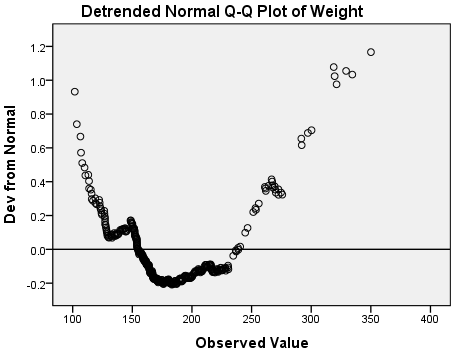
The Detrended Normal Q-Q Plot shows the same information as the Normal Q-Q Plot, but in a different manner. In the Detrended Plot, the horizontal line at the origin represents the quantiles that we would expect to see if the data were normal; the dots represent the magnitude and direction of deviation in the observed quantiles. Each dot is calculated by subtracting the expected quantile from the observed quantile. (This implies that if a dot is below the trend line on the Normal Q-Q plot, it will appear above the trend line on the Detrended Normal Q-Q plot, because observed - expected > 0.)


In addition to hypothesis tests and Q-Q plots, it's a good idea to look at a boxplot and a histogram of your data. Boxplots will give you a better look at outliers and the location of your quantiles; histograms allow you to easily visualize the distribution of your data. Both tools can help you decide if there are departures from normality in your data, and if they are severe enough to warrant concern.

About boxplot types in the Explore procedure

In the Explore: Plots window, there are three different display options for boxplots: Factor levels together, Dependents together, and None (which suppresses printing the boxplot). The Factor levels together and Dependents together settings only affect analyses with two or more numeric variables.

Two numeric variables, no factors

Factor levels together

Create separate graphs for each numeric variable's boxplot. This is useful if your numeric variables don't need to be compared to one another, or are measured on different scales.

Syntax
EXAMINE VARIABLES=English Math
  /PLOT BOXPLOT
  /COMPARE GROUPS
  /STATISTICS NONE
  /CINTERVAL 95
  /MISSING LISTWISE
  /NOTOTAL.

Dependents together

Draw the boxplots on the same graph. This is useful if you want to compare two or more numeric variables side-by-side (for example, pre-test and post-test variables). The numeric ranges for the continuous variables should be close to each other for best results; ideally, the variables should be measured on the same scale.

Syntax
EXAMINE VARIABLES=English Math
  /PLOT BOXPLOT
  /COMPARE VARIABLES
  /STATISTICS NONE
  /CINTERVAL 95
  /MISSING LISTWISE
  /NOTOTAL.

Two numeric variables, one factor variable

Factor levels together

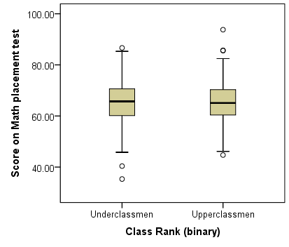
Create separate graphs for each numeric variable; within each graph, there will be a boxplot for each level of the factor. The individual graphs will show the comparative boxplots for each factor level side-by-side. This is useful in ANOVA-type situations where you want to look at differences in a numeric variable with respect to groups.

Syntax
EXAMINE VARIABLES=English Math BY RankUpperUnder
  /PLOT BOXPLOT
  /COMPARE GROUPS
  /STATISTICS NONE
  /CINTERVAL 95
  /MISSING LISTWISE
  /NOTOTAL.

Dependents together

Draw the boxplots on the same graph, and group them by levels of the factor variable.

Syntax
EXAMINE VARIABLES=English Math BY RankUpperUnder
  /PLOT BOXPLOT
  /COMPARE VARIABLES
  /STATISTICS NONE
  /CINTERVAL 95
  /MISSING LISTWISE
  /NOTOTAL.

Example: What do normality and non-normality look like?

Problem Statement

In general, human heights tend to be normally distributed, but human weights tend to be right-skewed. How can we check if our sample data follow these patterns?

Let's use the Explore procedure to look at a normally distributed variable and a non-normally distributed variable.

Running the Procedure

Using the Explore Dialog Window

  1. Click Analyze > Descriptive Statistics > Explore.
  2. Add variables Height and Weight to the Dependent List box.
  3. Click Plots. Check the box next to Normality plots with tests. Click Continue.
  4. Click Options. Change the missing value handling to Exclude cases pairwise. Click Continue.
  5. When finished, click OK.

Using Syntax

EXAMINE VARIABLES=Height Weight
  /PLOT BOXPLOT HISTOGRAM NPPLOT
  /COMPARE GROUPS
  /STATISTICS DESCRIPTIVES
  /CINTERVAL 95
  /MISSING PAIRWISE
  /NOTOTAL.

Output

The first table, the Case Processing Summary, shows how many valid values there were. Since we selected pairwise missing data handling, the analysis is using all complete information for each variable. We can see that there are more missing values for variable Weight (59) than there are for variable Height (27).

The Descriptives box appears next. It has detailed univariate descriptive statistics for each of the continuous variables, including skewness and kurtosis.

The standard normal distribution has skewness = 0 and kurtosis = 0, so we can interpret the sample skewness and kurtosis of our variables in relation to that. For height, the skewness is .23 (slightly right skewed) and the kurtosis is .113 (slightly heavier tails than a normal distribution, but not by much). For weight, the skewness is about 1 (right skewed) and the kurtosis is 1.5 (heavier tails than a normal distribution). These numbers alone aren't very good indicators of departures from normality, but they can supplement the graphs and the normality tests.

The Tests of Normality table contains the Kolmogorov-Smirnov and Shapiro-Wilk tests for both of our variables.

For weight, the K-S and Shapiro-Wilk test p-values are both very small (p < 0.001), so the decision to reject is very clear. However, for height, the results are not as clear-cut: the K-S p-value is p = 0.049 (which is just barely below the significance level 0.05), and the Shapiro-Wilk p-value is p = 0.070. These tests are suggesting contradictory conclusions: The K-S tests suggests non-normality, but the Shapiro-Wilk test suggests normality. How do we resolve this discrepancy? Let's look at the graph output.

The plots for variable weight make it very clear why the normality tests came back significant:

Boxplot of weight. The distribution is skewed right.

The boxplot of weight shows that the distribution is skewed right. Signals of this include:

  • Shorter left tail, longer right tail
  • Median (the center line in the box) is left of center
  • Outliers on the high end of the distribution

The Q-Q and detrended Q-Q plots show systematic deviations from normality: notice that the overall shape of the detrended plot is parabolic (U-shaped). Also notice that the deviations from normality are relatively large: the y-axis of the detrended normal q-qplot indicates that the deviations range in magnitude from -0.2 to 1.2.

With that in mind, let's evaluate the graphs for variable height:

Boxplot of height. The distribution is mostly symmetric, except for some outliers on the high end.

The right and left tails appear to be about the same length. There are some outliers on the high end, and the median is slightly left of center; however, it's not nearly as severe as it was for the weights. In general, the heights appear to be symmetrically distributed about the center of the distribution.

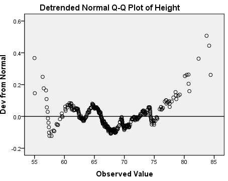
The normal Q-Q plot shows that almost all of the observed height values are the same as what we would expect if this data were normally distributed. The deviations appear to mostly occur in the tails. The detrended normal Q-Q plot acts as a magnifying glass for this, allowing us to see just how strong the existing deviations are: the y-axis of this plot shows that the deviations from normality range from -0.2 to 0.6. There's no obvious trend to the deviations like we saw for the weights.

Discussion and Conclusion

Between the skewness in the boxplot, the strong and systematic deviations in the Q-Q plots, and the two significant normality tests (p < 0.001), we have overwhelming evidence suggesting that variable Weight is not normally distributed.

For variable height, the evidence is much weaker. One test is significant (K-S test p = 0.049); the other is not (Shapiro-Wilk p = 0.070). After looking at the graphs, we see that there are some deviations from normality, but they do not appear to be very large. For practical purposes, then, it is not unreasonable to assume that variable height is normally distributed.


There are several hypothesis tests that can be used to test for normality. However, it is important to not rely on these tests alone: you should always use graphical measures like boxplots, histograms, and P-P plots to corroborate them.